Lava’s founder and creative director, Hans Wolbers, is in Moscow for a lecture when he meets Alexandra Sankova. She tells him about her dream to establish the first design Museum in Russia. This meeting is more or less a starting point for the collaboration. Why Alexandra asks a Dutch designer to help her
realise a Russian design museum? She wants a museum with an international vibe.
Thanks to the client’s feedback we get inspired by a typical Russian crystal pattern. This has multiple advantages: Familiarity: crystal objects with this particular
pattern can be found in most Russian homes. Abstraction: the pattern offers flexibility and openness, Design: the concept is derived from an
actual product of Russian design.
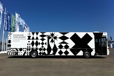
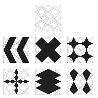
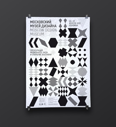
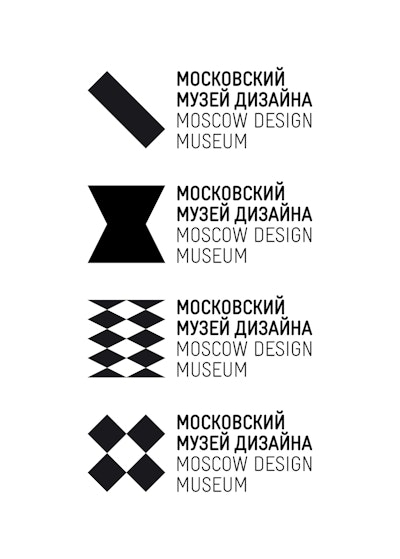
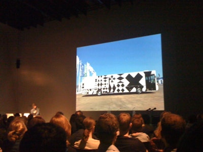
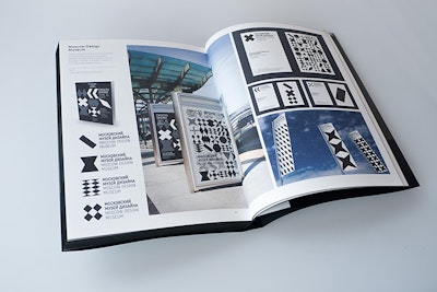
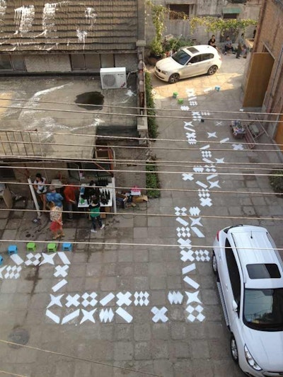
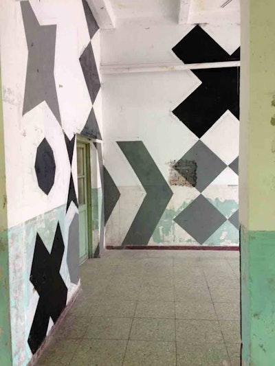
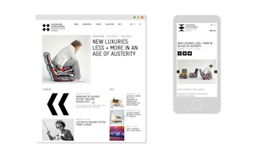
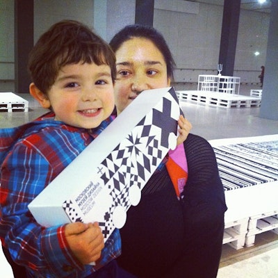
The icons for the logo are generated on a hard-angled grid that can render dozens of interesting shapes, resulting in a flexible logo with many variations and possibilities but always with a very coherent and distinct DNA for all of them. Whether using one shape or twenty, the visual identity of the Moscow Design Museum is highly recognizable no matter where you apply it.
