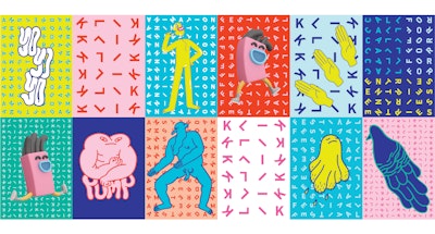
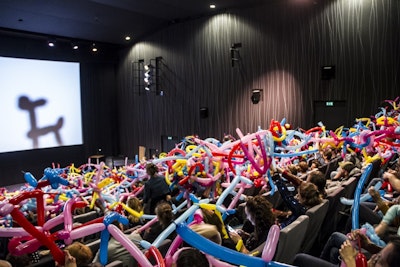
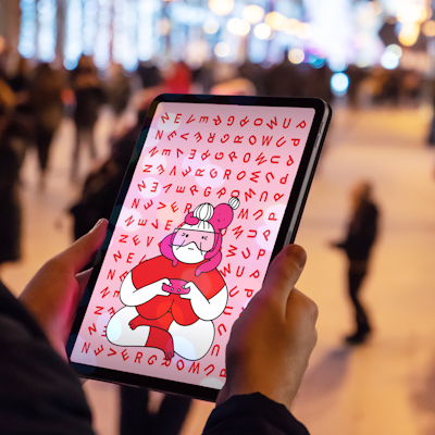
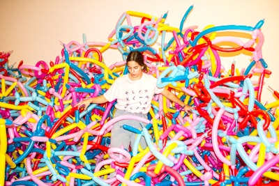
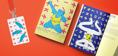
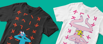
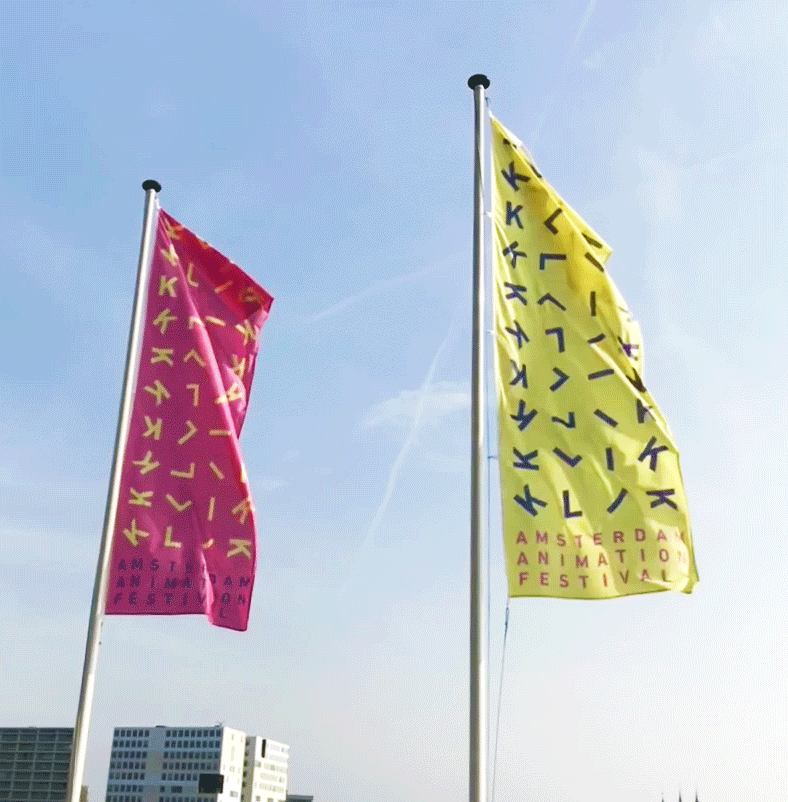
Animation means motion. But how do you show motion in things that don’t move? At a festival there are a lot of offline and physical items. How do we translate the energy, the liveliness and the dynamics of what KLIK is all about, to all their moments of brand interaction? Next to this, they deal with a target audience that is very diverse. Grandparents visiting with their grandkids, sector professionals, students, makers and many more. This brings another challenge: serving all audiences in a way suiting to their needs and expectations, while keeping the KLIK character as a steady factor throughout.
We created a cinetic system that moves - even when it doesn’t. Typography rotates, twirls, tumbles and spins. With a custom made brand-system we ensure that for every item needed, the KLIK energy can be applied. Waving flags with spiraling letters, pirouetting page numbers and wheeling wayfinding. To radiate the dynamic vibes of the festival, we select a bright colour palette that is age-transcending. For every edition we cooperate with another illustrator, who is not afraid to push the boundaries of the expected. One year you might be watching a wrinkly old lady in a bathing suit taking selfies, while the next you’re bubbling away in a hot tub with undefinable creatures.